top of page

You're Making Me Blush!

Blush Pink is HERE TO STAY!

Are you scared of using the color pink/blush in your designs, perhaps thinking that it is too feminine? Don't be! Shades of blush really vary and can be quite sophisticated, calming & even subtle. Enjoying learning about, "You're making me blush" and the plethora of hues in this family. They have been popular for many years and are here to stay, keep reading to see why.

You're making me blush color board

Blush is a pink color that certainly incites a reaction. For most people, it is a very calming as well as a reassuring color. It is not an aggressive color like its cousin red, but rather it is red's softer version. It is still filled with the passion and vitality of red but with the addition of white, it tones it way down and creates a much calmer mood.


Blush probably originated from the 18th century with the combining of white with red iron oxide to create a pinkish color. The color blush is one of the shades from the pink color family that is more muted and soothing! The red and white proportions are what create the hue blush. This lovely color is romantic, happy, charming, tender, subtle, soothing, and sophisticated to name just a few adjectives.


Technically speaking,... https://www.color-name.com/ tells us that "Blush Pink has the hex code #E8C7C8. The equivalent RGB values are (232, 199, 200), which means it is composed of 37% red, 32% green and 32% blue. The CMYK color codes, used in printers, are C:0 M:14 Y:14 K:9. In the HSV/HSB scale, Blush Pink has a hue of 358°, 14% saturation and a brightness value of 91%." (just in case you were wondering).


Please don't confuse the elevated color blush with bright sugary sweet pink candy or in-your-face hot pink, instead, blush is a barely-there color that can be considered neutral. It is soft, sophisticated, and subtle, and can be used in just about any style of design in your interior spaces. Even though it is often associated with a feminine color, it can be used as gender-neutral in a variety of design settings.


Kate Smith, an internationally recognized color expert, consultant, and designer says this on her blog regarding the color pink:

Positive Associations

We associate pink with the innocence of childhood and unabashed play. If giggles had a color, it would be pink, and pink used in design reveals a willingness to embrace wonder and creativity. Pink can soften formal design, and its influence can lighten up dark, stodgy colors.


Notice the variety of hues of blush on this mood board. You can see that it is definitely in the pink family, yet not like nursery pink. It evokes feelings of peace, calm, happiness, & hope, yet is both subtle as well as sophisticated.

You're making me blush mood color board

So, you've decided that you like the color blush, now,... where do you use it? Here are a few ideas:


(1) Since blush has such a calming effect be sure to use it in a space that is meant to be relaxing! Picture yourself winding down and de-stressing after a long day in a beautiful room infused with the calming color of blush.


(2) Perhaps you are not entirely convinced that you want to go blush all the way, that's okay too. Use it as an accent. Perhaps, you could buy a blush throw for the bed or sofa. Blush accent chairs in the living room. A blush vase or candles. Dip your toes in the blush pool just a little at a time and see how this lovely color makes you feel.


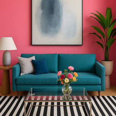
(3) Jump outside the classic and traditional box when thinking about using the color blush. It lends itself beautifully to contemporary, modern, and eclectic spaces.


you're making me blush color board
 

Stop! Don't Stop,...You're Making Me Blush!

Here are a few timeless blush colors to check out.


Benjamin Moore's First Light

PHOTO COURTESY OF BENJAMIN MOORE

Benjamin Moore's First Light 2102-70

Here, an accent wall in First Light 2102-70 provides a burst of blush besides walls and ceiling in White Heron OC-57.

 
Sherwin-Williams SW 6316 Rosy Outlook

PHOTO COURTESY OF SHERWIN-WILLIAMS

Sherwin-Williams SW 6316 Rosy Outlook

Just like the name implies, this color is a pink that’s soothing, uplifting, elegant and classy.

 
Sherwin-Williams SW 6323 ROMANCE

PHOTO COURTESY OF HGTV

Sherwin-Williams SW 6323 ROMANCE

is more of a coral-pink hue.

 
Sherwin-Williams SW 6617 Blushing Color

PHOTO COURTESY OF SHERWIN-WILLIAMS

Sherwin-Williams SW 6617 Blushing

A more neutral pink that works well in living rooms and bedrooms.


I hope that you have enjoyed checking out this lovely color and are considering using it in your own space. I feel that you will love being surrounded by it and I hope that "you're making me blush".


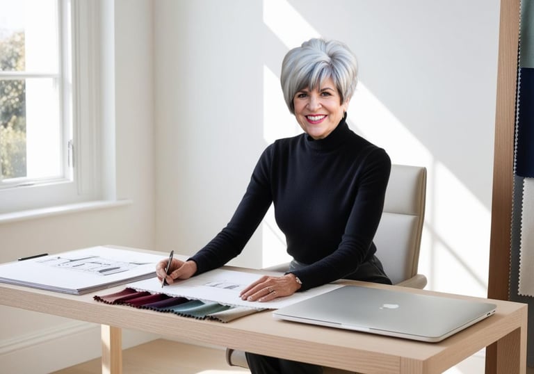
As a professional interior designer and color consultant I write articles that help you with your design decisions, please check out my other posts about color and design on my Interior Design, Blog Page.


... until next time!

Janice Kay

0 comments
bottom of page